Administered by:


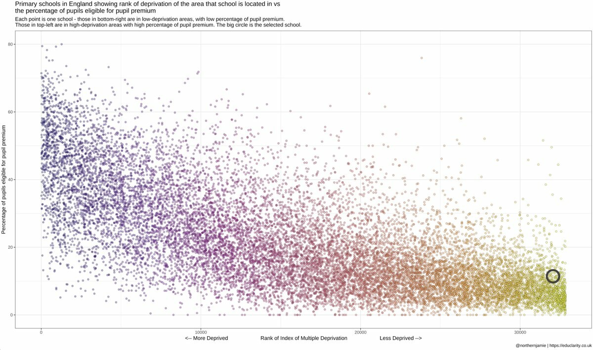
Made this well-snazzy chart for the school #governors' datapacks that I'm building. Pupil premium %s vs deprivation of school postcode. Outliers are the most interesting, but whole thing is useful to understand context of individual schools. https://educlarity.co.uk for more deets